Wine labels Part II: Inspiration behind Bordeaux designs
In Part 1 (April 8th), we looked at the history and development of wine labels from ancient times to the modern day. In “Wine labels Part 2”, leading Bordeaux châteaux tell Westgarth Wines the tales behind their wine labels.
Pallatial elegance, eastern glamor – Château Ducru-Beaucaillou
An eclectic blend of western and eastern splendor, the label of Château Ducru-Beaucaillou features an oblique view drawing of the grand estate building set against a rich golden background.
“This label was created by the Johnstons, who owned the estate at the end of the 19th century, and, except for only slight changes, it has never changed,” Bruno Borie, co-owner and manager, told Westgarth Wines. “It has always been this beautiful yellow, orange, and gold. I think the inspiration was the Venetian Palladian palaces that were painted in this beautiful yellow color. Château Ducru-Beaucaillou has a note of this style. Also, the late 19th-century Nathaniel Johnston married Princess Mary of Caradja from Istanbul, and she was a princess from a Greek family installed in Turkey who were very close to the sultan. Mary probably introduced this beautiful yellow color, which was eastern – Orientalism was a style that was very fashionable at the end of the 19th century.”
Borie thinks the label’s hue was also influenced by the contemporary allure of the Far East. “I don't know if it was the intention, but I think that they were already shipping to Asia in those days, and gold was the color of the Chinese Emperor.”
As well as being attractive, it stands out, said Borie. “I'm so proud of this label, and my father and everybody before me were too. When you are in front of a shelf or when you are in a restaurant, you immediately recognize that Ducru-Beaucaillou label. It's a unique label that you need probably half a second to find.”
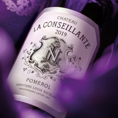
Pride, pomp, and petals – Château La Conseillante
The elegant, gray-scale label of Château La Conseillante expresses quiet family grandeur with a shield-like shape emblazoned with the initials of the founder, Louis Nicholas, surrounded by climbing, delicate, stylized florals and berries.
“The inspiration behind the label is very simple, because it was the logo of Louis Nicolas. We call it in French, the ‘armoirée’, the logo with the little flowers and the ‘L’ and the ‘N’ inside is for Louis Nicolas,” explained general manager, Marielle Cazaux.
The traditional character of the label is enhanced by the violet color of the bottle neck foil. “If I go further, the purple caps will remind us of the violet notes we can find in the wine,” Cazaux added.
Color expression – Château Lafon Rochet
When Château Lafon Rochet had a facelift, going from pale gray to a color explosion, the winery team didn’t stop there. Next was the label, which, today, displays an arresting mustardy yellow background for a front-view drawing of the elegant château. A patch of diagonally moving vineyards in front of the house provides a graceful touch of energy to the label.
“The color of the label comes from my father’s idea to paint his château because it was gray and he didn't like this color,” general manager Basile Tesseron told Westgarth Wines. “My father is the opposite of me in terms of color. I like almost no color while he enjoys plenty. So, he painted the château in three different colors for a year at a time — yellow, green, and red.”
After trying out these three colors, Papa settled on yellow for the château. “So, in 2000, he said, ‘okay, fine. If we paint the château in yellow, we should paint the label as well’. So, that's how the bright yellow color is now on the label. We know it's a bit flashy, but everyone knows it's our wine.”
A historic tale – Château Beychevelle
Bucking the tradition of displaying a beautiful Bordeaux wine estate, Château Beychevelle shows an intriguing, black-and-white boat on its label. A griffon-like figurehead looks confidently out across a calm river while a lowered sail is hung with a plump bunch of grapes and a pennant-shaped flag on the mast waves proudly.
The image reflects the origins of the estate, which date to the early 17th century, when the first Duke of Épernon, a celebrated French admiral, took over the château on the Gironde River. His esteemed reputation was so widespread that passing boats would show their respect by lowering their sails. This inspired not only the winery’s emblem but its name: Beychevelle, from the Gascon phrase "Bêcha vêla," means "lower the sails”.
“You don't see a building, you don't see a chateau or a gate, which is very common on wine labels,” managing director Philippe Blanc told Westgarth Wines. “You've got this white corner cut label with a boat, which is quite rare and is very definitely recognizable as Beychevelle. Some people think the boat is a viking boat, but it's not. It’s a local boat going along the River Gironde and lowering its sail to show respect to the Duke.”
Classic Left-bank style – Château Margaux
For every Bordeaux wine label that changes over time, there are as many that barely alter. One such label is that of Château Margaux. Bearing an image of the house’s iconic neo-classical château, following rebranding in recent years, the label’s typeface is reminiscent of the style used by the estate in the late 19th century.
Philippe Bascaules, managing director, commented on the pedigree of the overall design. “The label of the bottle of Château Margaux is very old. It was designed at the beginning of the 19th century. It's just the image of the château — that became our logo. I think it's probably one of the most famous wine labels.”
Want to read more? Take a look at some of our other blogs here:


